
Over the years CSS has grown… a lot. Just like with HTML and JavaScript APIs (like geolocation and web storage), the specification for CSS—that is, what constitutes correct CSS rules and properties—is managed by the W3C, the World Wide Web Consortium. Until fairly recently, CSS was managed by one working group, and specified in one, large document. But after CSS2.1, the working group realized that CSS needed to be split up into modules to make it easier to maintain.
While you might hear the term “CSS3” thrown around (I’ve used it myself!), there is no one CSS3. Instead, we now have a collection of modules that together define CSS. The best way to see all the various modules is to go to the W3C Table of Specifications:
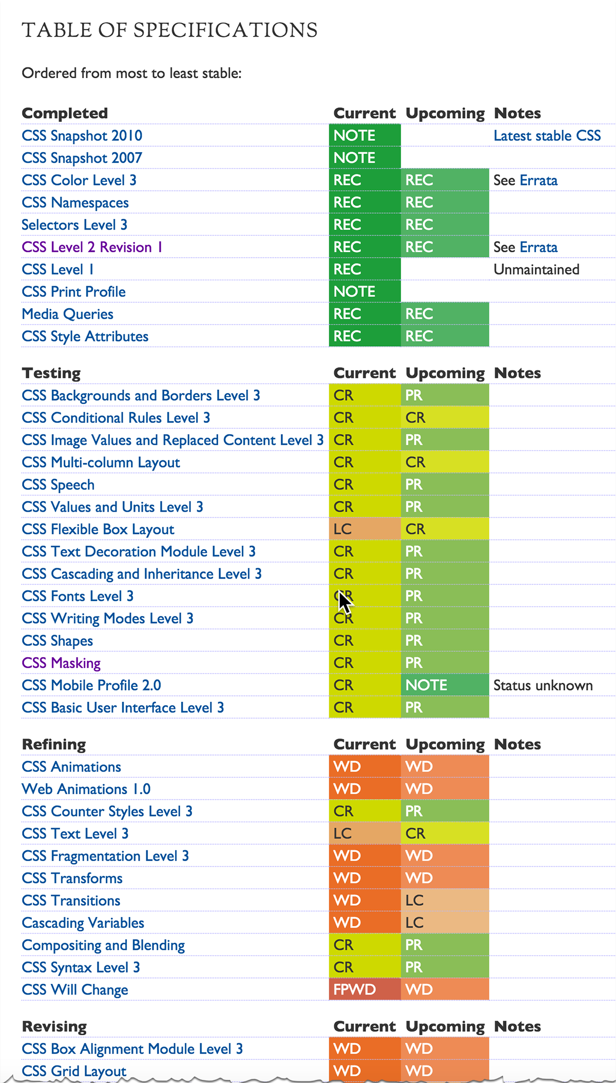
There are a lot more modules than are shown in the screenshot above so I enourage you to go the site and check it out for yourself. Notice that each module has a current and upcoming status that are color coded (green to red), and a code, like REC, CR, PR, WD, and so on. Also notice that some modules also have a “level”, like “Level 3”. This just means that the feature was originally specified in CSS2.1, and has been expanded on in the current module.
The color and status codes are explained below the table. Any module that is dark green and REC is an official Recommendation by the CSS working group. That mean it’s likely to be implemented in all modern browsers. Many browsers will also implement features in modules that aren’t yet full recommendations, so just because a module isn’t listed as a full recommendation doesn’t mean your browser doesn’t support it. The process to go from an idea to a full recommendation takes a long time, and so if browser makers (and the public) like an idea before it makes it to full recommendation, you’ll often find that idea implemented while it’s still in one of the earlier stages of development for the specification.
That does mean that sometimes features implemented early on can change. A great example of that is flexbox, or Flexible Layout. This feature went through several different incarnations, with different properties names and values before stabilizing to its current definition. As of this writing, flexbox is in LC status—Last Call—so it could change, although it’s unlikely at this point.
If you want to use one of the features in a CSS module, and you want to know if it’s implemented in a browser—or, better yet, all browsers, so people using your web page will get the best experience—then one of the best ways to check is to use the site http://caniuse.com/.
For instance, if you type in “flex” at the top, you’ll see that flexible box layout has wide support in browsers, although Safari and iOS Safari still require the browser prefix, -webkit- (mouse over the Safari entry to see the note that says, “Supported with prefix -webkit-“):
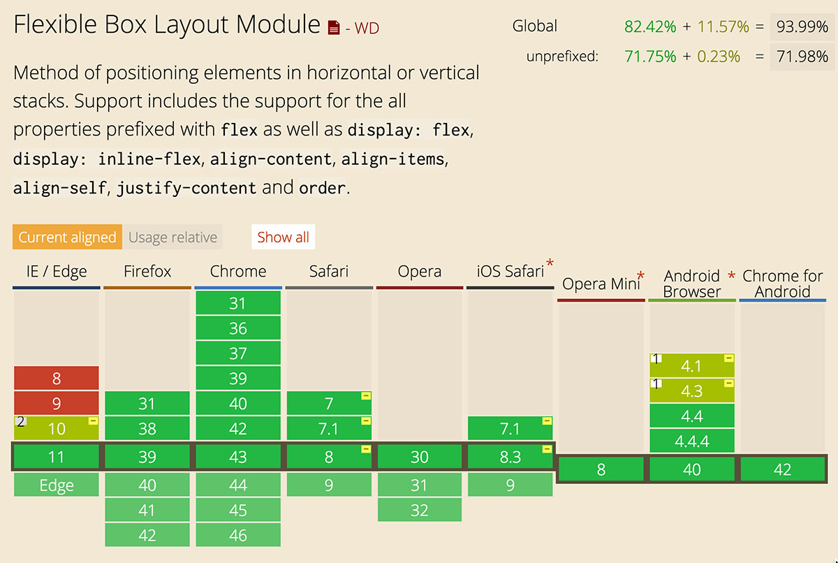
The browser prefix requirement means that if you want to use flex to style your elements, you’ll need to provide multiple properties in your rule; one for each browser that requires the prefix, and one for the final property names for flexbox properties. For instance, if you want to display paragraphs using flex, you’d write:
p {
    display: -webkit-inline-flex;
    display: inline-flex;
}
Safari will use the first property, and ignore the second; all the other browsers will ignore the first property and use the second.
If you mouse over the IE10 entry in the http://caniuse.com/ page for flexible box layout, you’ll see a note that says “partial support with prefix -ms-” and below that, “Only supports the 2012 syntax”. That means that IE10 supports older versions of the flexbox property names, which makes creating CSS for this older browser a little bit trickier. As an example, the property to justify boxes using flex display is now justify-content, but IE10 uses the older property name, flex-pack. So, to justify boxes for browsers, and include IE10 browsers, you’ll write:
p {
    display: -webkit-flex;
    display: -ms-flex;
    display: flex;
    -webkit-justify-content: center;
    -ms-flex-pack: center;
    justify-content: center;
}
including the IE prefix on both the display property, flex, and on the old syntax for justify-center.
Heading back to the Table of Specifications, notice that you can click on the name of the module to get to the in-depth specification for that module. These specifications will give you all the details for how that CSS feature works, and often, examples. The flexbox, or Flexible Layout Specification is long, because flexbox has a lot of properties, and it provides lots of great examples to help you understand how flexbox works. (Not all specifications have such good examples!). No matter what you read in the specification, remember, not all browsers may implement the features as they are specified yet! So, for newer features, it’s always good to check http://caniuse.com/, and other resources, like the browser documentation pages, such as the Mozilla Developer Network, the Safari reference guides (which usually works for Chrome too, since both browsers are based on webkit), and Microsoft’s reference guides for Edge and IE.
Finally, don’t forget that whenever you use cutting edge CSS features, make sure your pages still look good on older and mobile browsers! There are often good fallback strategies for CSS features, so keep those in mind as you’re developing your code and test, test, test.